Brand Identity & Logo System for a Software Development Startup

The Challenge
Algotix AI, a software development startup, needed more than just a logo.
They wanted a brand identity that could:
Establish credibility in a highly competitive tech market.
Reflect innovation, intelligence, and forward-thinking solutions.
Work seamlessly across digital, print, and international platforms.
The Solution
Mivora designed a complete brand identity system with multiple logo variations and usage grids to ensure consistency across every channel.
Key Deliverables included:
Primary Logo & Icon System → A clean, modern mark with a bright orange accent symbolizing energy, intelligence, and innovation.
Full Brand Identity → Typography, color palette, and scalable variations (light, dark, and monochrome) for flexible use.
Brand Guidelines → A structured identity grid ensuring perfect alignment across web, social, and print.
Strategic Consultation → Aligning the visual language with Algotix AI’s mission of building reliable, global-scale software.
Visual Identity in Action
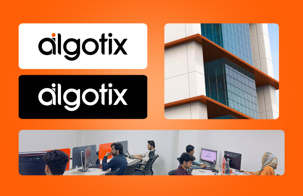
Logo Variations: Icon, wordmark, light/dark versions, and grid layouts for flexible brand use.
Applications: Office branding, team workspace visuals, and digital assets.
Social Presence: Profile marks adapted for LinkedIn and international digital platforms.
The Impact
The new brand identity gave Algotix AI:
A professional, investor-ready presence that builds instant trust.
A distinct look separating them from generic tech competitors.
A consistent visual system adaptable to global use.
Since the rebrand, Algotix AI is growing rapidly and has already been recognized by international clients — proving the power of a strong brand aura backed by strategy.
👉 Want your startup identity to make the same impact?
🚀 [Get Your Branding Package Today]
