Logo Design & Identity Concept
The Challenge
⚠️ Needed a professional identity for a competitive brokerage & marketing sector.
⚠️ Must symbolize growth, trust, and forward-thinking.
⚠️ Logo should adapt well to digital platforms & print.
The Solution
We created two strong logo directions for flexibility:
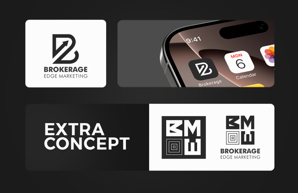
🅱️ Primary Concept – “Arrow in B”
✔ Modern B monogram with an upward arrow → growth & progress.
✔ Clean, timeless typography for professional credibility.
✔ Works across apps, websites, and printed assets.
🎯 Extra Concept – “BMW Grid”
✔ Bold geometric grid for structure & strength.
✔ Communicates stability & solid foundations.
✔ Designed for alternative branding campaigns.
Visual Identity in Action
Mobile app mockups → Logo looks clean & sharp in digital environments.
Scalable usage → Works seamlessly on light & dark backgrounds.
Extra variations → Flexible for future brand extensions.
The Impact
Professional investor-ready identity that builds instant trust.
Visual language of growth & stability, aligned with the brand’s mission.
Multiple logo concepts → gives the client branding flexibility & adaptability.
👉 Want a brand identity that speaks growth and trust like Brokerage Edge Marketing?
💡 [Book Your Branding Package Today]
